
Case Study
LoopNote – Rethinking Voice Memos as Visual Loops
2023
Project Details
Duration
3 Weeks
Role
Designer and Developer (Solo Project)
Project Context
LoopNote started as a personal challenge: I wanted to reimagine how voice memos could feel more visual, interactive, and meaningful—especially for visual thinkers like myself. Traditional voice memo apps felt uninspired: long, linear, and difficult to scan through or organize. The goal was to explore how voice notes could be turned into “loops”—visual tiles that represent short audio ideas with metadata like mood, tags, and waveforms.
Project Outcome
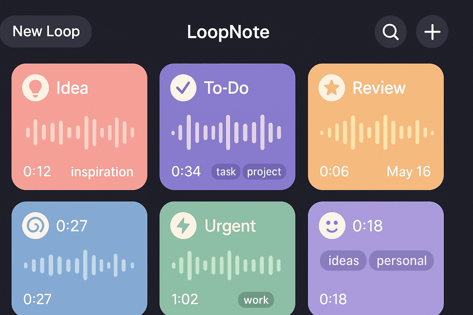
The end result was a high-fidelity prototype of LoopNote: a mobile app where each voice memo becomes a tappable loop with color-coded categories, a visual waveform, and a “preview mode” that plays just the first 2 seconds when scrolling. The project helped me land new client work focused on audio-based tools and gave me a fresh piece for my portfolio that demonstrated storytelling, motion design, and interface polish.
The Problem
As someone who regularly uses voice memos for creative ideas, I found myself constantly frustrated by:
Forgetting what a memo was without listening to the whole thing
Not knowing how to organize or quickly scan notes
The visual monotony of seeing a list of timestamps and filenames
This led to the guiding question:
How might we reimagine voice notes as spatial, scannable objects rather than static list items?
Digging into the research
This was a personal project, so my research was lean but still structured:
1. Self-audit of habits
I reviewed my last 100 voice memos across two devices. Only 12 had been replayed more than once. I noticed:
I often record ideas while walking or driving
I rarely name the recordings afterward
I use them like sticky notes—quick, disposable, reference-only
2. Informal user conversation
I casually spoke with 4 other creatives (a musician, designer, writer, and developer) about how they use audio memos. Common themes:
“I never title them, so I’m just guessing what’s what.”
“Scrolling through 30 identical recordings feels pointless.”
“I wish it gave me a snapshot of the vibe or mood.”
These conversations helped me define personas:
The Quick Recorder: uses voice memos like scribbles
The Organizer: wants tags, categories, and archiving
The Audio Explorer: wants playback to feel musical and fluid
3. Competitive scan
I looked at Apple Voice Memos, Otter.ai, Noted, and Bublup. Most were functional but lacked any emotional connection to the audio. No visual summaries, no audio mood indicators, and almost all used default filenames (e.g., “Recording 104.m4a”).
Ideation
Inspired by music apps and modular synth UIs, I sketched out a concept of audio “loops” as visual blocks that could:
Play previews on hover/tap
Be categorized by emotion or topic
Include a short waveform preview
Show tags, mood icons, and timestamps
Each block could be moved or grouped like sticky notes on a digital corkboard.
I wireframed key screens in Figma:
Home grid view of audio loops
“Loop creation” screen with mood selector and tags
Playback view with color-coded waveform
I also prototyped how a 2-second “loop preview” could auto-play as users scrolled—this felt playful and rewarding.
Testing and Feedback
I shared the prototype on Twitter and in 3 UX Slack groups. I received feedback from about 15 people. Highlights:
Positive feedback:
“This feels like a mood board made of sound.”
“I’d 100% use this for tracking song ideas.”
“The color tagging is genius—helps me remember why I recorded it.”
Critical feedback:
“I’d want folders or some way to group loops beyond color.”
“Needs better playback control for longer recordings.”
“Animations are a bit slow; might feel frustrating at scale.”
I also screen recorded user reactions as they explored the prototype—many instinctively tapped the waveform, which helped inform interaction tweaks.
Iterations and designs
I made several refinements
Introduced a drag-and-drop grouping system
Allowed users to favorite and archive loops
Optimized animation speed for quick tapping
Reworked the waveform interaction to include a scrub feature
Final visual design leaned into a soft, lo-fi aesthetic with pastel gradients, rounded corners, and tactile shadowing. Icons were custom-made to reflect moods: lightbulb (idea), spiral (mental loop), lightning bolt (urgent), etc.
Key learns
Creativity thrives under constraint
Limiting myself to a 3-week sprint forced clarity in scope and decisions.
Microinteractions = personality
A sound-based app needs feedback—taps, previews, pulses. I focused heavily on motion and feedback loops.
Reframing utility as expression
Turning a voice note into a colorful tile shifted the product from tool to canvas. It made people want to play, not just record.