
Case Study
Revolutionising WhatsApp Collaboration with Meetup
2023
Project Details
Duration
12 Weeks
Role
Junior Product Designer
Project Context
During my time at university, I was challenged to enhance the collaborative features within WhatsApp. After considering multiple solutions, Meetup for WhatsApp was born. This project aims to seamlessly integrate event planning functionality through Meetup. Rooted in extensive user research, persona development, and iterative design processes, Meetup seeks to address common pain points such as difficulty organising group plans and finding crucial information within chat threads.
Project Outcome
Meetup introduces a seamless event planning feature within WhatsApp, enabling users to effortlessly organise gatherings, meetings, and events directly within their chat environment. By integrating collaborative functionality, such as scheduling and centralised event information management, Meetup addresses users' frustrations with existing limitations, streamlining the planning process and enhancing communication efficiency.
The Problem
How might we foster collaboration in group chats?
1.1 Defining the Problem
I identified a common pain point among WhatsApp users: the struggle to organise plans around multiple people's availability. Whether for professional projects or social gatherings, users face difficulties keeping track of crucial details within rapidly moving group chats. My goal was to create an intuitive, collaborative solution for event planning within the existing WhatsApp framework.For this project to be a success, it was important that I identified clear pain points that I could work towards solving. This would turn out to give me guidance when making design decisions.

Digging into the research
1.2 Discovering what collaboration means to WhatsApp users.
Research served as the foundation of my redesign strategy, encompassing a comprehensive exploration of user behavior, preferences, and pain points.
How are people currently using WhatsApp
Chat quickly to catchup with friends/families/colleagues.
Share media such as photos or video between Users
Group communication - both socially and professionally.
User Pain Points
Difficulty finding messages relating to a specific topic/event.
Making group plans in a fast pace threaded messaging system.
Returning to discussion around a topic/event after conversation has moved on.
With these areas identified. It was time to make a decision on how I was going to tackle the broad problem of making WhatsApp more collaborative for its users. The two main options I landed on were:
A specific tool for event planning
Pros | Cons |
|---|---|
Solves clear pain point of losing messages | Takes users away from chat experience |
New to the market - not offered by competitors | Friction in changing user behavhiour |
All communication in one place |
Collaborative photo albums
Pros | Cons |
|---|---|
Would allow users to add to shared photo albums | Shared media already exists in sub menu |
Media sharing wouldn't interfere with flow of conversation | Not a quick way to send images |
Would only really be beneficial after an event | |
Would still be hard to find specific images later on |
After weighing up different options and despite the potential negatives, I decided to go with creating a specific tool for event/meeting planning. Part of this reasoning comes down to a study by Michael Suefert analysing the use of group chats within WhatsApp - Ultimately finding that only 2% of users are NOT in at least one group chat within WhatsApp.
1.3 Applying this knowledge to the users
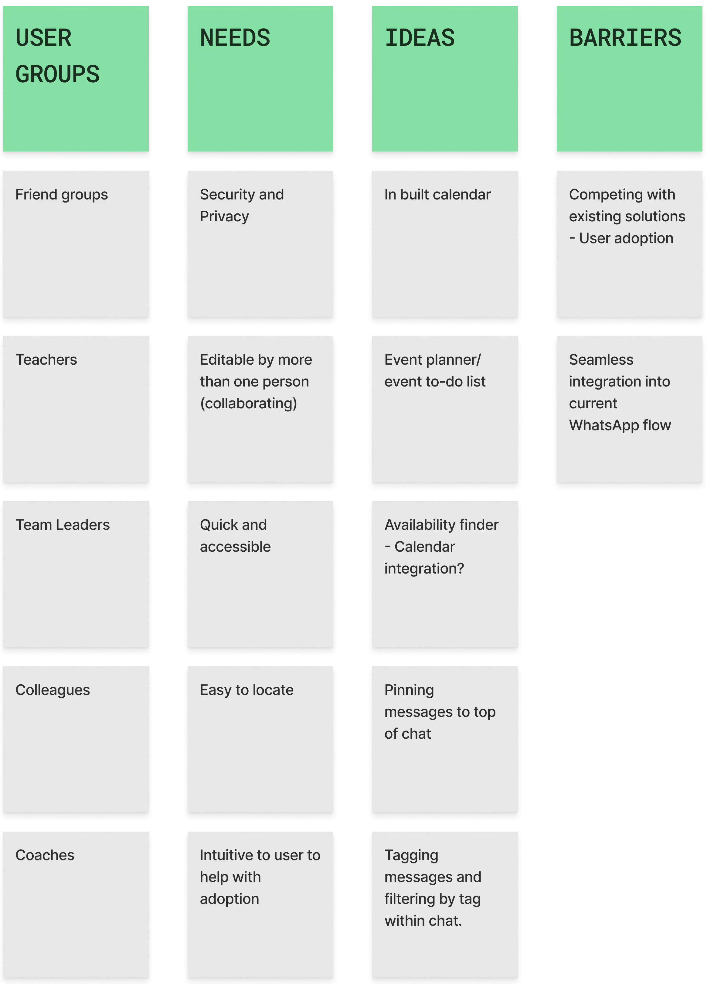
Using this information, I was able to generate user personas based on their expected behaviour.
Developing personas for this particular project was interesting as I needed to consider two different types of user flows - People who plan events and people who attend events. This was a new and exciting opportunity for me to empathise with different user groups and discover how they would interact with eachother.

1.4 What I learnt from persona development
People like Joan, who love to be in control and require clear communication will need to feel like they have the ability to create events and make changes as they need. Furthermore, additional planning features would aid someone like Joan in not only finding a good meeting time but pre-planning their time together, making the event more efficient.
Eric is the polar opposite of someone like Joan. People like Eric, have other priorities and use social media and chat apps very quickly. Whilst this is great for them, it means they can miss a lot. When developing Meetup, I asked myself: “How can we make sure people don't miss an invitation.” This was later solved with the addition of the sticky banner. Missing information was the biggest pain point found when completing user research and this aims to resolve that issue for lackadaisical users like Eric.
Ideation
2.1 Ideation
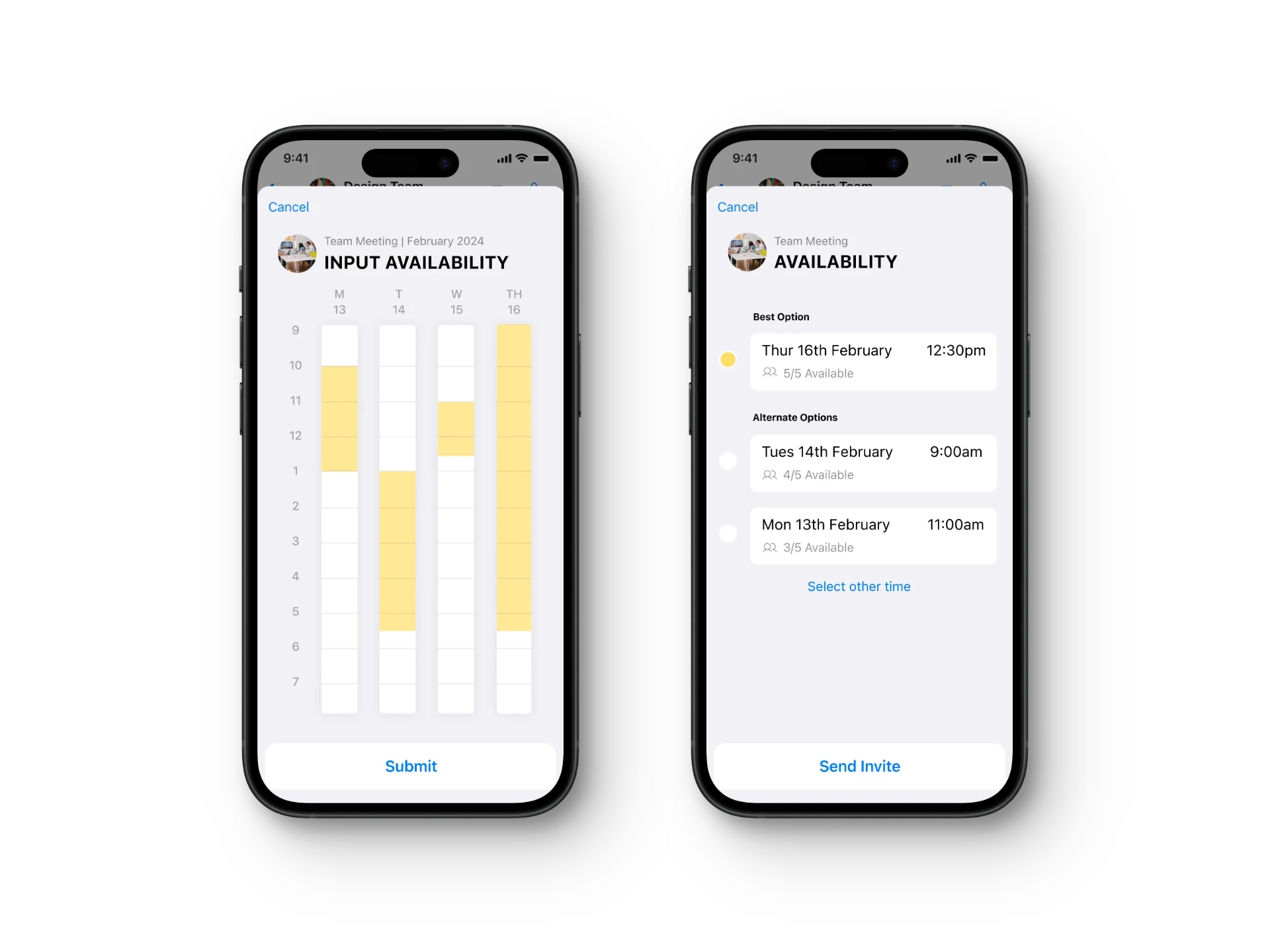
An Affinity Map was created early on to understand the scope and potential of the project. Getting a deeper understanding of non-negotiables and listing out some early ideas was beneficial to get the ball rolling with Meetup. This affinity map also had an influence later on when considering a go to market strategy for the feature itself; by knowing early on who our primary user groups were going to be. This stage was incredibly important as it gave me a great starting point and allowed me to start thinking about potential solutions without filtering or restricting myself.
2.2 Refining Meetup
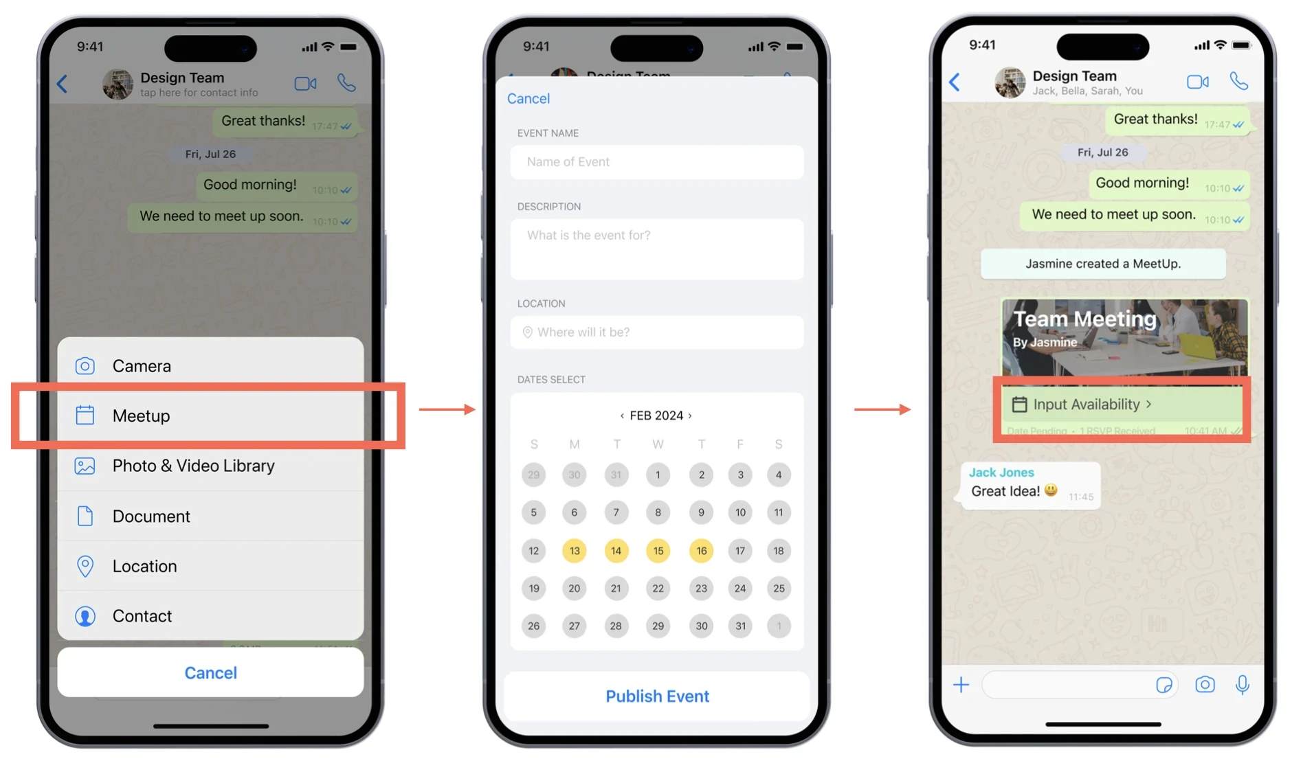
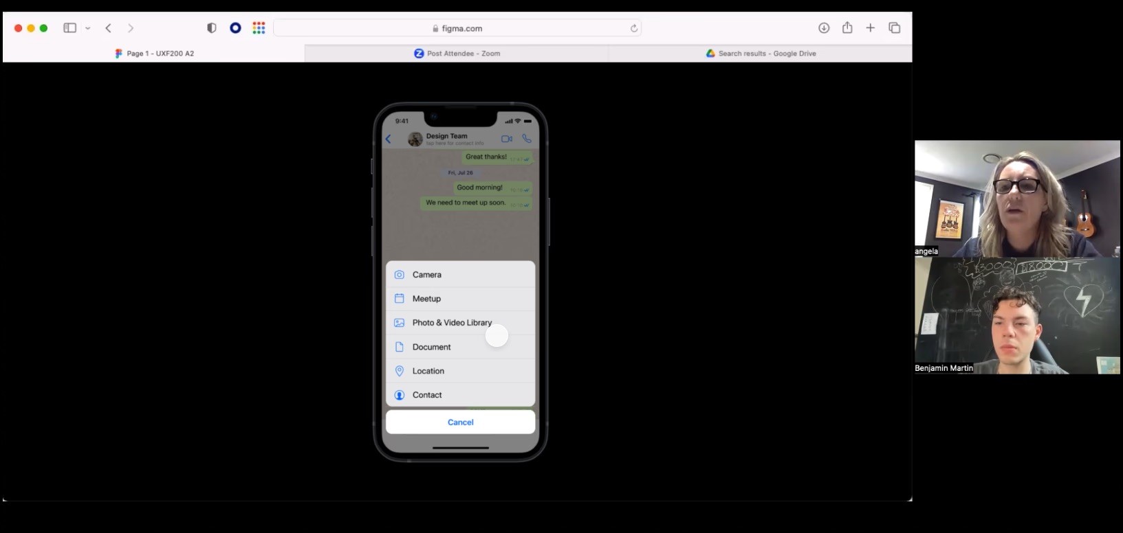
With a good amount of information in front of me, it was time to decide what this event planning tool would look like. A major consideration was working within the existing framework of WhatsApp. This is where I leant on the idea of creating a new category in the menu options where users would be used to finding items such as "poll."
The thinking behind this was that based on current user behaviour - when user's want to share/collaborate, they already use this menu with features like poll, sharing documents or location. It was a natural place for something like "Meetup" to live.
This strategy would also help with user adoption in that hopefully users would stumble upon the new feature during their regular use of the product. This would insight curiosity and reduce overall friction for new adopters.
3.1 What does the journey look like, tangibly.
Low-fidelity wireframes were created to visualise the user flow, identifying key elements and interactions essential for Meetup's functionality.

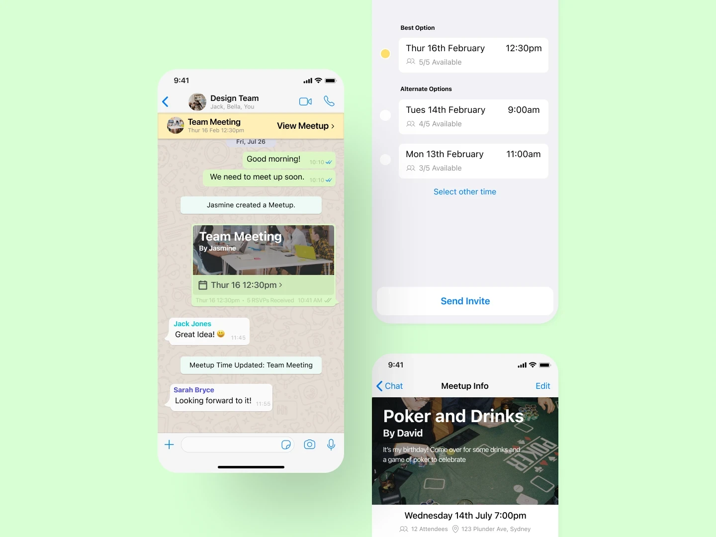
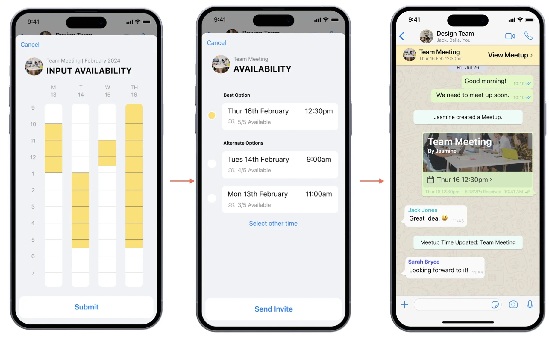
3.2 Key Feature 1 - Availability Finder
A major pain point identified in the discovery stage of the process was around timing and schedules. It can be impossible to liase with groups of people to make plans. The idea of the availability finder was to take this burden away from the user without making them feel like they have no control. Through being able to get feedback from group members as it suits them and then collating the information for the organiser, the process goes from being a tough game of time Tetris and into a simple form.
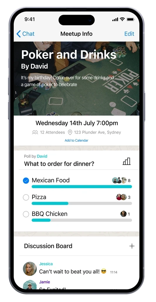
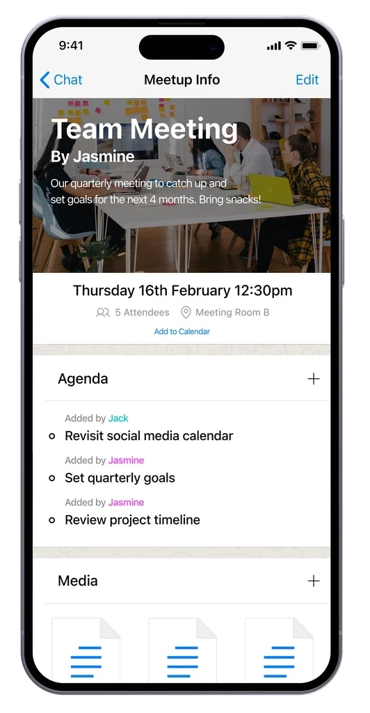
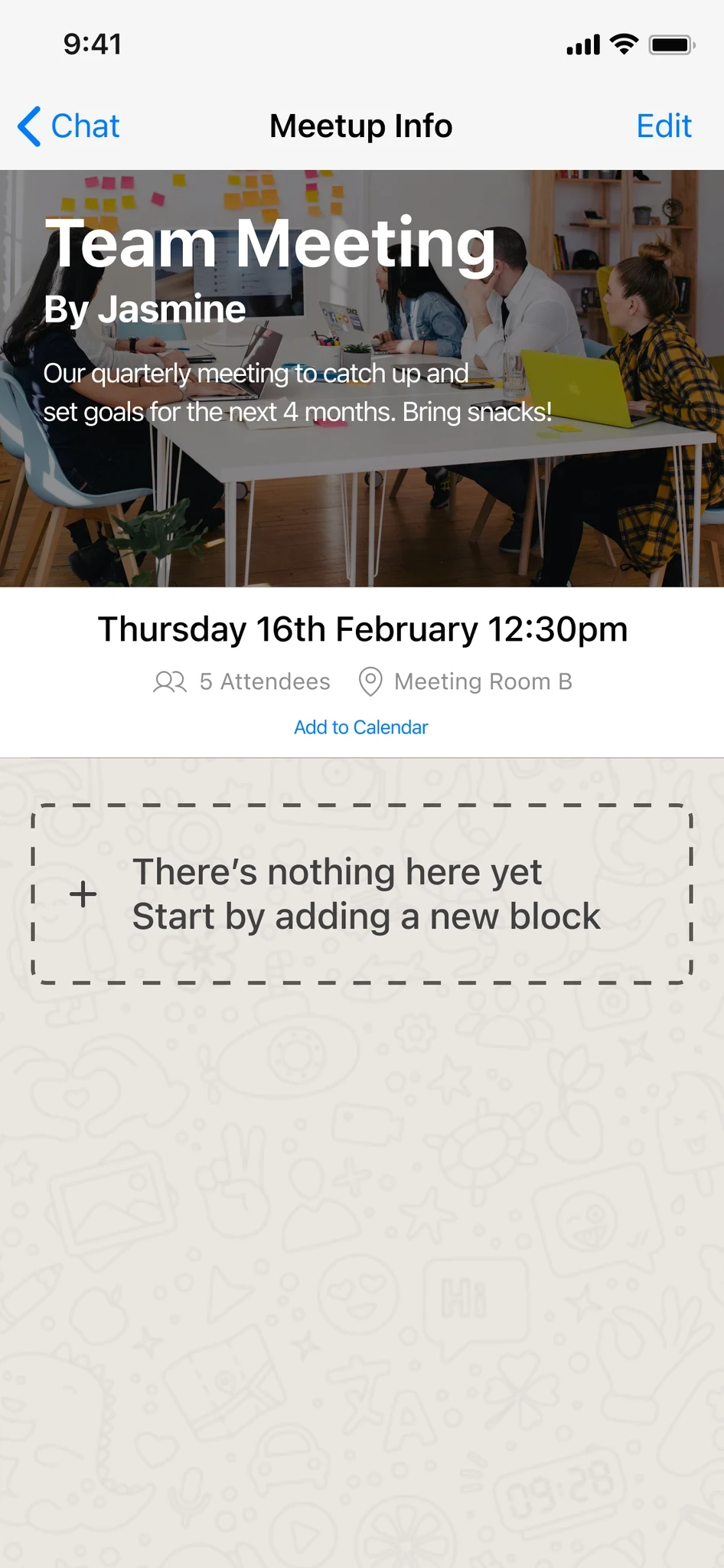
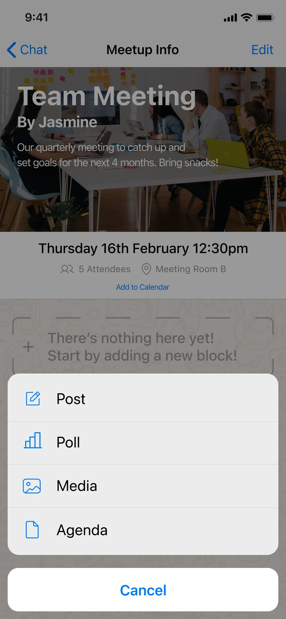
Key Feature 2 - The Meetup Info Page
Meetup as a tool is useful, but paired with the Meetup event page, it really comes to life. Finding availability between people is not necessarily new but having a central hub dedicated to all commentary being in one place allows a major pain point of all users to be mitigated. Meetup page customisation is an important aspect that allows for users to create a page that is relevant to their event or task. This creates an agile feature that is just as useful for all user groups, from professionals organising meetings to friend groups hosting parties.
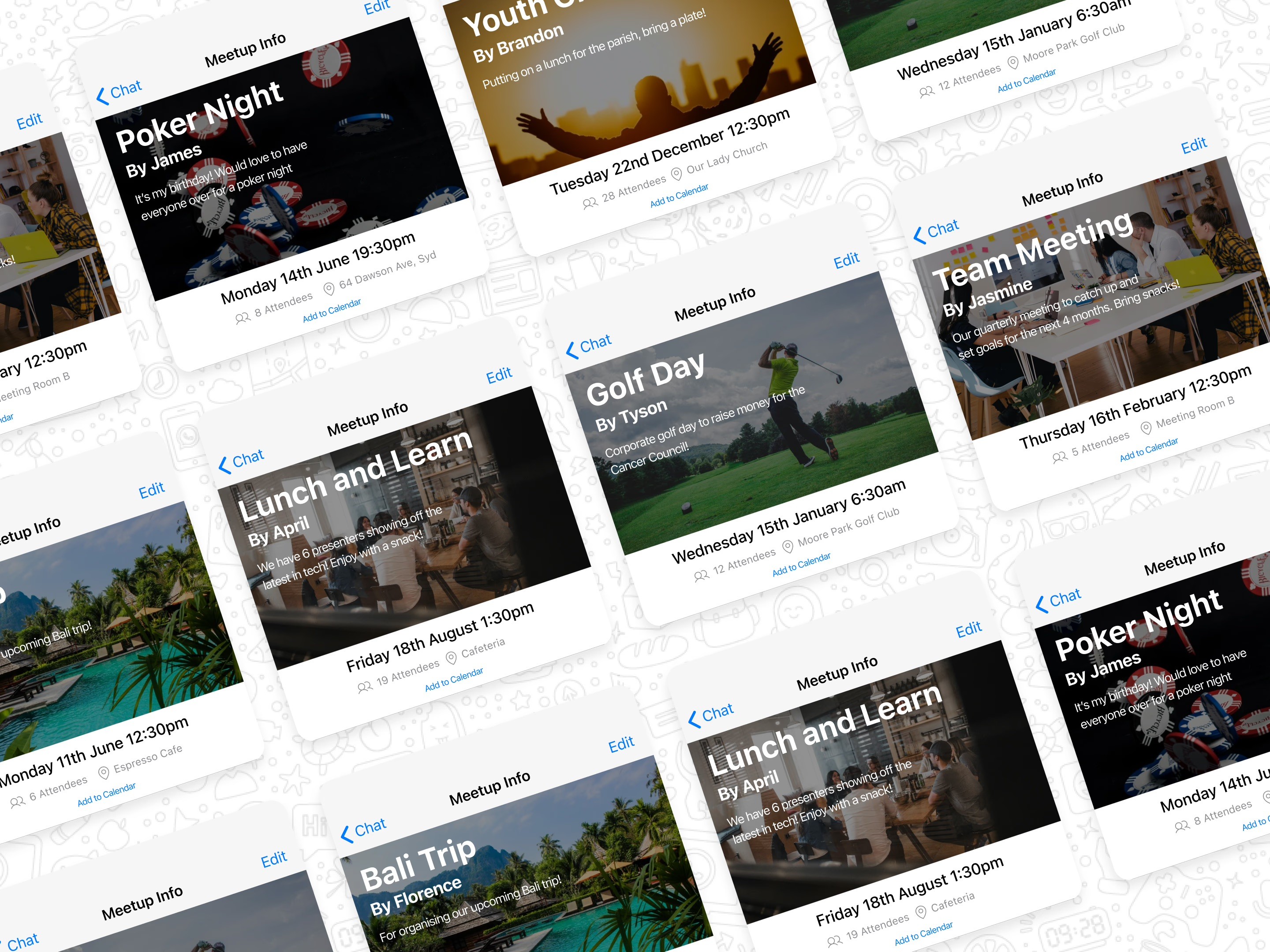
Meetup as a whole is a dance between two key features - The availibility finding process and the Meetup Info Page. Once an event has been confirmed, the Meetup Info Page is available up until the end of the event. The page is customisable to suit the event. Subheadings such as Polls, Media, Posts, Agenda and Tagged Messages can be added or removed. This solves the identified user pain point of not being able to locate messages relating to an event/topic.
3.3 Designs
Meetup seamlessly integrates into WhatsApp, offering users a comprehensive solution for planning, collaborating, and sharing within their chatrooms. The feature automates scheduling based on user availability, streamlining event planning. The Meetup Info Page centralises event-related information, ensuring no detail gets lost in chat threads.
 |  |
Testing and Feedback
4.1 But was it any good?
After bringing my ideas and designs to life, it would've been nice to sit back and enjoy myself but it was clear that my next step was to show Meetup to some regular WhatsApp users to get feedback. To do this quickly, I developed a prototype using Figma that mimicked the full functionality of both WhatsApp and the ideal flow of Meetup. With this prototype, I conducted usability sessions and noted down insights based on things that worked well and things that didn't.
4.2 Defining Testing Criteria
The pre defined objectives from user testing included:
Evaluating user satisfaction and usability of the Meetup feature | Identify any usability issues or pain points. | Validate the effectiveness of Meetup in addressing existing pain points |
|---|
4.3 Who should I ask?
Professionals using Whatsapp for work | Students communicating with friends/classmates | Family members talking to other family members in the same country |
|---|
4.4 The big sessions!
I conducted virtual usability testing sessions with each participant individually, completing 15 session in total, 5 from each user group. Each user would complete the following tasks:
Create a new event and invite participants
Responding to an event invitation and indicating their availability
Viewing an event and finding event related information.
4.4 What did the users say?
Pros | Cons |
|---|---|
Most users found meetup easily and clicked on it out of curiosity. | Some users weren't sure if they should click the message notification when someone else created a meetup. |
No one got lost in the flow and could easily navigate between screens. Users also knew when their task had been complete. | Users had trouble distinguishing between colours on the availability selector - whats available and what is not |
Users overall reported that they could see themselves organising events through this tool | It wasn't clear that users could customise the Meetup Info Page |
Usability session
Usability session
Iterations and designs
5.1 Implementing User Feedback
I wanted to solve two key users issues during this iteration process. The first being that users were unaware whether they were selecting available time or unavailable time in the availability flow and the second being the friction between users accessing the meetup page and realising that they can add and customise it.
5.2 Making the intention clearer
Users had one main issues with the input availability screen: Not knowing if they were entering when they ARE available or when they are NOT available.I attempted to solve this issue with 2 key design decisions. Changes made were:Adding copy below the header to outline that the user is picking when they ARE available.Introducing a blockout pattern for unselected areas of the time chart. With these additions, the intention of the page was clearer to users and led to a higher completion rate.
Before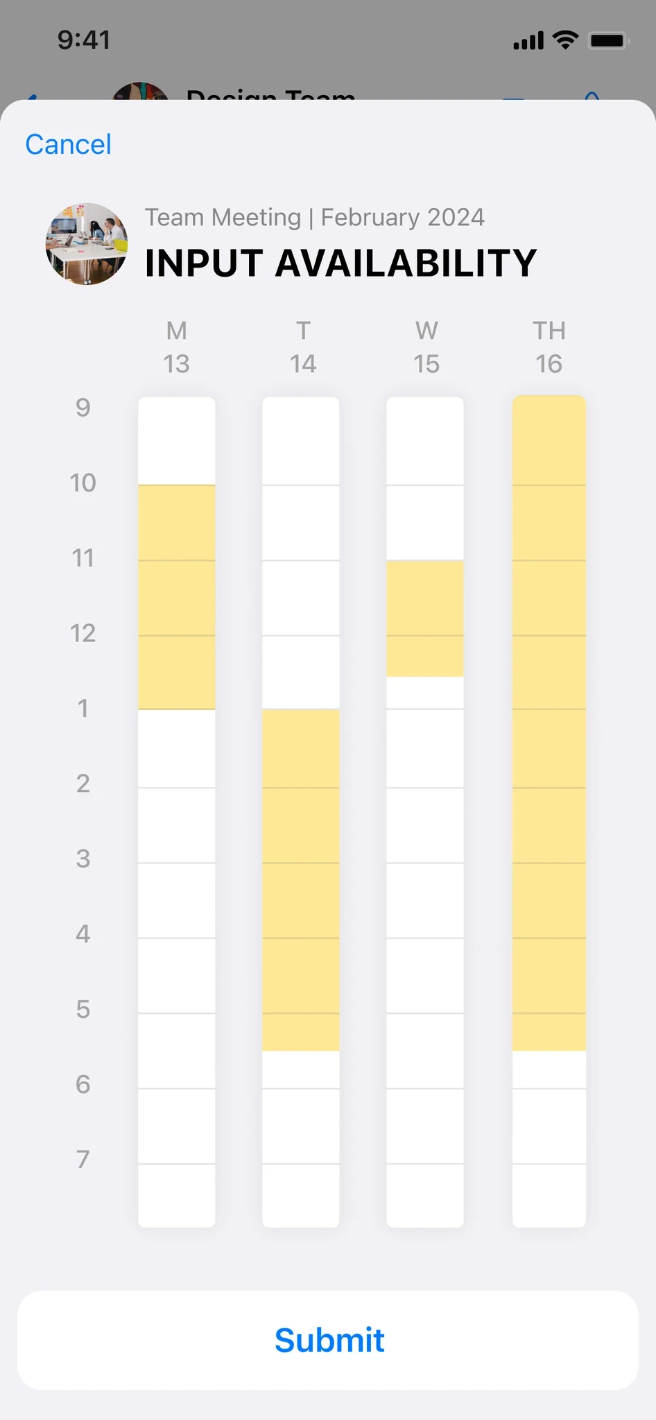 | After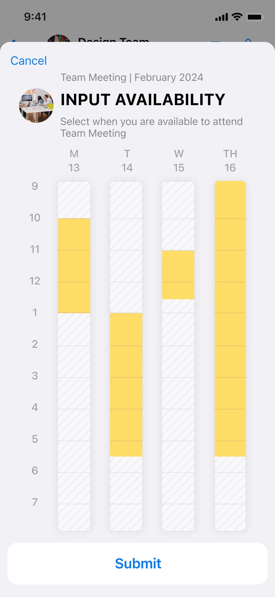 |
5.3 An invitation to have fun!
During user testing, I noticed that most users would visit the Meetup Info page and not realise that they could add/edit content. This completely devalued the feature as users were not intrinsically using it to solve their pain point.I realised that users could not easily find the tool to add items to the Meetup page. This was addressed by adding an invitation to add a new block when a page is empty.Inviting the users prompted them with curiosity to add information.
 |  |
Key learns
This project provided valuable insights into user-centric design and developing within existing frameworks. By addressing the needs of diverse user personas and adhering to WhatsApp's design guidelines, I delivered a solution that seamlessly attacks current pain points. Having clear goals in mind from the start really helped me align my design decisions and give me guidance towards solid solutions. Ultimately, through undergoing user testing, it was a great reminder to me that despite your plans and goals, it's super important to understand products from a point of view that may be different to your own.